The Art of Brewing: Mason Ale Works (Ale Sharpton, Issue 11)
Dope can art. Marvel Comics. The glory of creative freedom.
The following article by Ale Sharpton was originally published in February 2025 in Issue 11 of Final Gravity, our print beer zine telling personal, human-centered stories about beer. You can order the print issue here, or subscribe here.
***
Having real estate on the craft beer shelves of bottle shops is always competitive due to the extensive varieties of beer styles worldwide, not to mention the homefield advantage of locals politicking for some extra love regarding prominent visibility. While quality, popularity, trends, and overall demand matter, captivating label art is just as essential to attract potential consumers.
Taking a cruise through the aisles of one of Atlanta’s most respected ale and lager retailers—Krog City Market’s Hop City—I couldn’t help but gravitate to the fascinating cans by Mason Ale Works, including the Bride of Dankenstein West Coast IPA. Admittedly, I was already a fan of the San Diego, California-based brewing company’s consistent production of that style, my favorite type. But the artwork? Fire. I appreciated the vibrant nods to pop art, Marvel comic books, and classic horror movies, to name a few inspirations we could all relate to in one way or another. And with that, I reached out to the Mason team and booked an exclusive interview with their talented creative director and senior designer, Billy Daggers. With a cool name like that, I knew his answers disclosing the reasoning behind the stellar packaging would not disappoint. Let’s get to it.
***
Ale Sharpton: Peace, Billy. First off, your work is crazy and congrats on your position. Tell us a little about yourself and how you got into the business and ended up with Mason Ale Works.
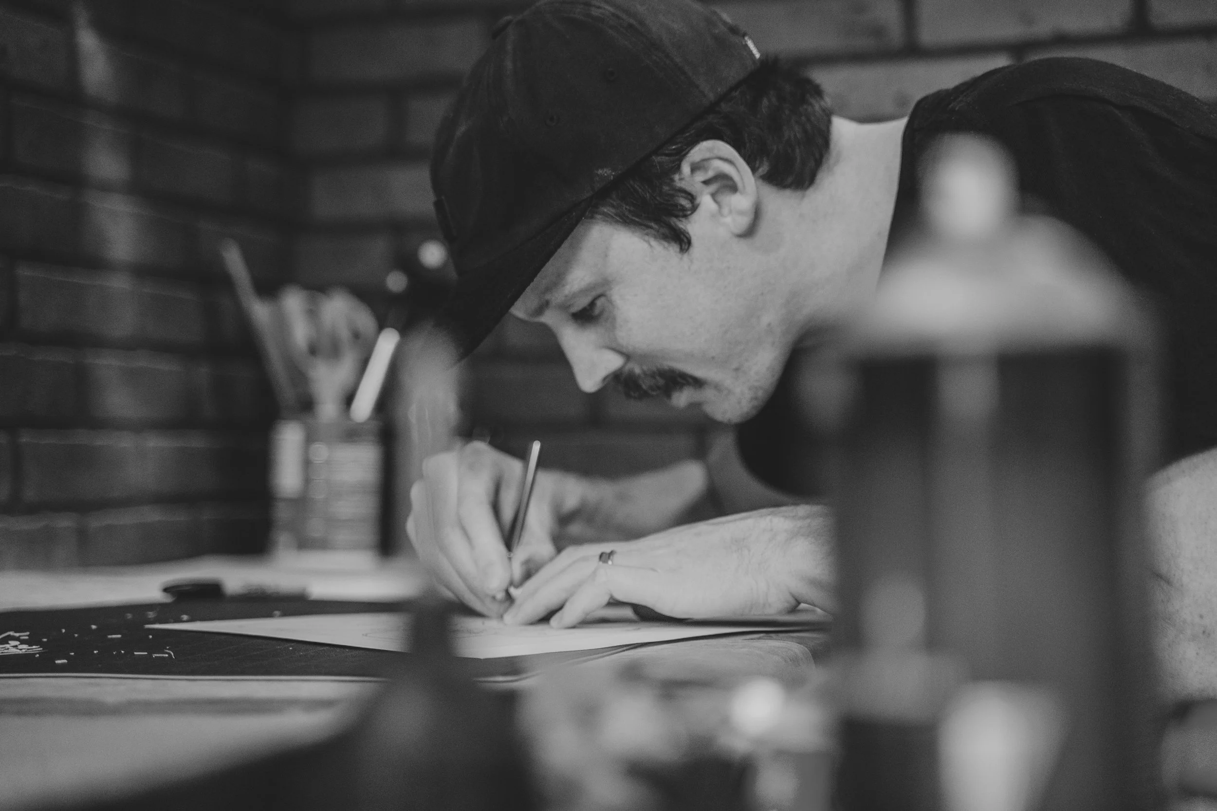
Billy Daggers: I’m a self-taught artist with over 20 years of experience making art, both physically and digitally. A brief backstory, I started out tagging in sewer tunnels with friends back in the early 2000s. When I started hitting more public walls, I transitioned to spraying hand-cut stencils, so I could be in and out quicker. As those pieces continued to get buffed over, I started painting a version on canvas before spraying it on a wall. Over the following years, I continued developing my stencil technique, began selling my work on canvas and eventually started being invited to show in galleries.
About three years ago, I was invited to exhibit in a Thor-themed art show in the Bay Area called “By Odin’s Beard!” and I want to give a shout-out to Miles Ritchie and Crush Comics for this opportunity. My painting was a reimagining of the God of Thunder as an 80s skateboard graphic. That painting was then sold to Grant Tondro, the founder of Mason Ale Works, who later reached out and asked if I would be interested in turning it into a beer label. I jumped at the opportunity and once that label was finished, I floated the idea of creating a series of labels inspired by classic comic heroes. He green-lit the project and after a year of freelancing labels for them, I was asked to take over as creative director and lead designer for the brand. I was told “I want this to be ‘Mason Ale Works by Billy Daggers’.” Since then, I’ve put all of my soul and creative energy into making this brand something I’m super proud of.
Ale: That’s dope. Let’s discuss Mason Ale Works’ philosophy behind the can designs.
Billy: Mason Ale Works is all about making each can a work of art, not just a container. When customers are walking down endless aisles of beer with 100 different IPAs that are all made with similar hops, I want our cans to catch their eye and make them say, “Whoa, that’s rad! I’ll give this one a shot.”
It’s awesome to see how many people save our cans and display them in their art collections because the theme connected with them personally. As an 80s kid, I draw a lot of inspiration from things that remind me of my childhood like comic art, TV shows, movies, skateboarding, and even common household items. So many labels these days play it safe with simple, clean lettering, focused solely on communicating the type of beer with the latest buzzwords to help sell it. We like to have fun with our cans and make them look as good as they taste.
I appreciate how loose and fearless the can art is. Please share your creative process to conceptualize a can, from beer to art.
I’m fortunate to have full creative freedom at Mason, so I’m not locked into one specific theme or stuck designing a label I don’t care for. Since this is currently my main creative outlet, I usually make whatever idea excites me the most at the time. Sometimes I have an idea for a label, and we’ll produce a beer that fits with that theme. Sometimes we just come up with a random interesting name and then I get to figure out what that would look like visually. We’re constantly producing new beers each month, so I get to do a lot of experimenting, which keeps it exciting.
As a fellow creative, I appreciate that freedom. Good shit. Okay, now it’s time for the “favorite child” question: What are your top three can designs and why?
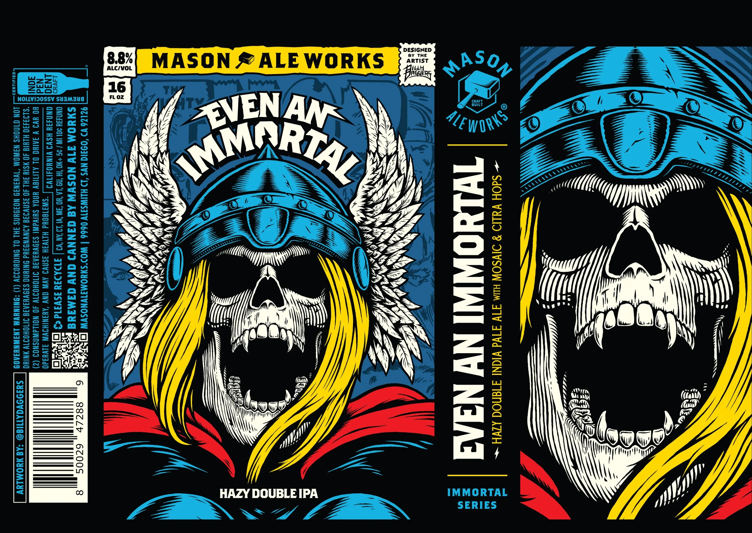
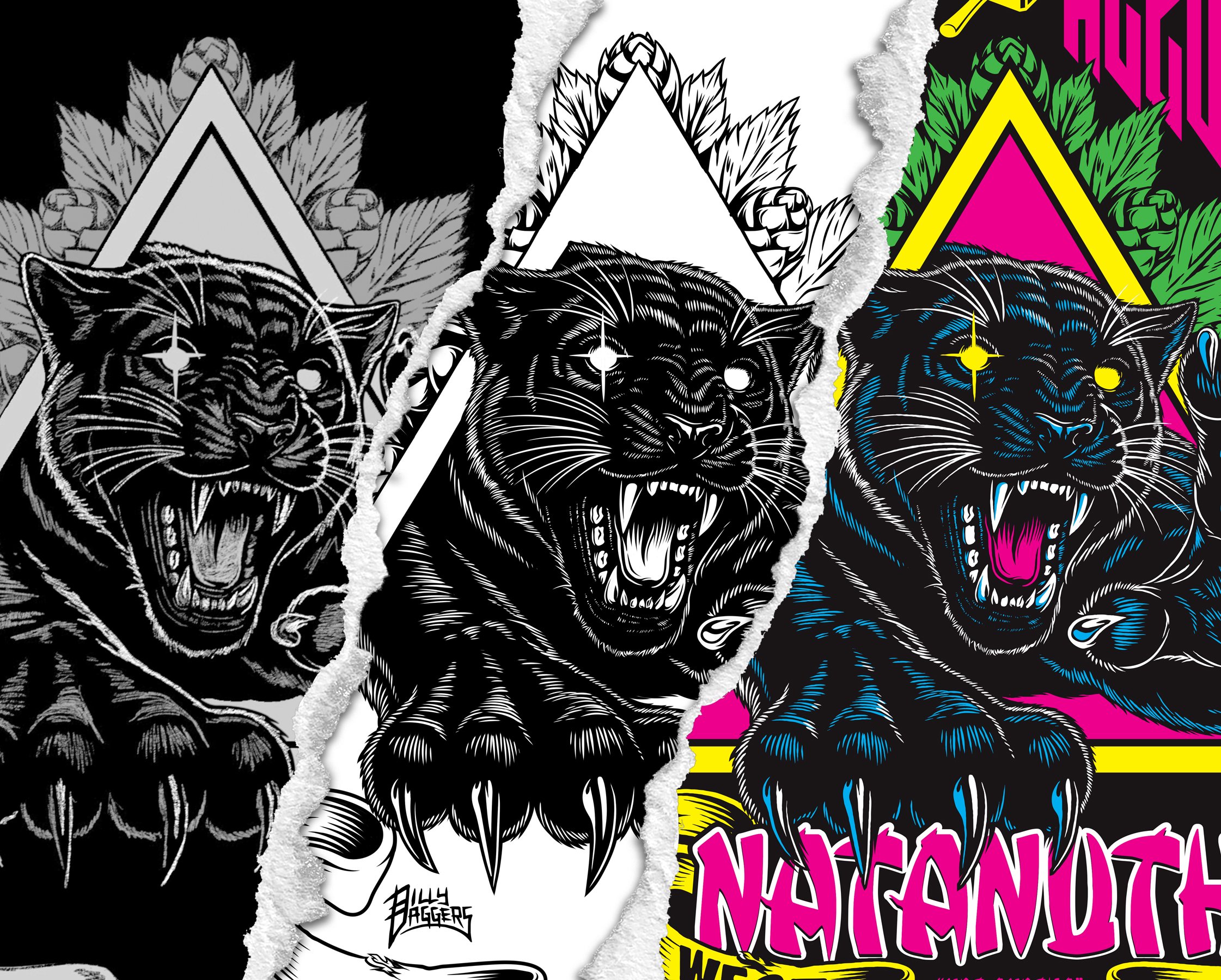
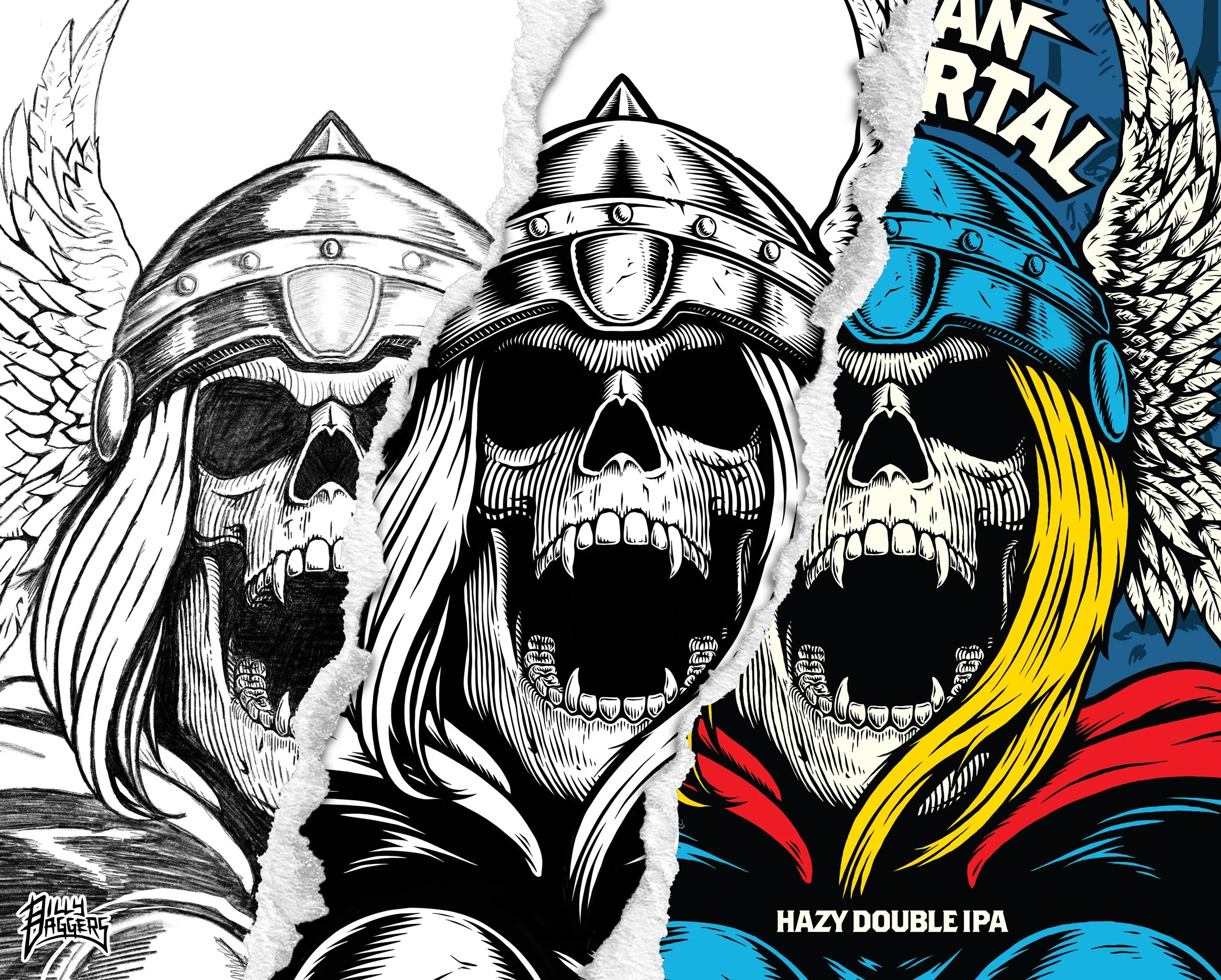
The Even An Immortal Hazy Double IPA is a label that will always be in my top three. It was the first beer I created for Mason Ale Works and the one that kicked off my career in the beverage industry. The name of the beer matched the name of my painting, which came from the cover of the 1977 comic, The Mighty Thor #262.
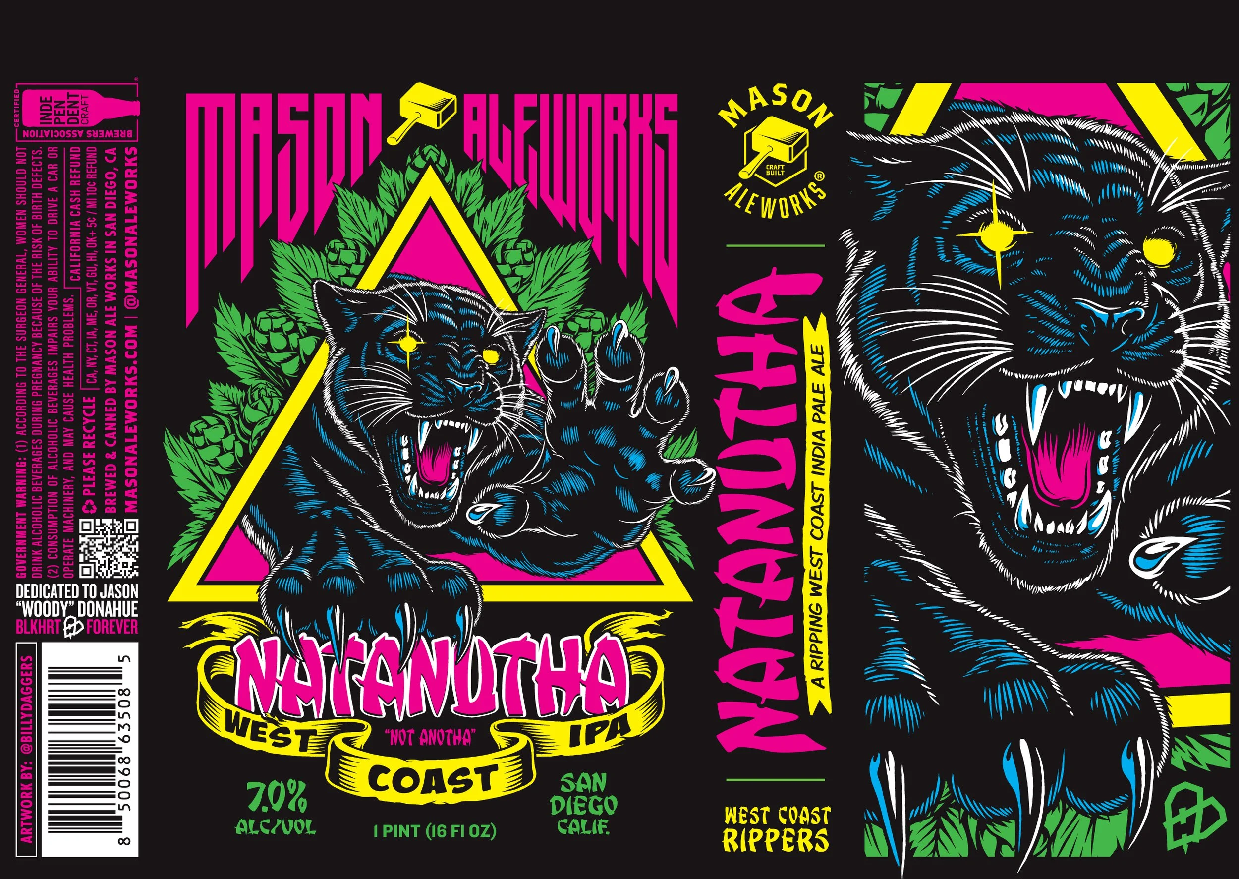
Number two is Natanutha (pronounced like “not another”), a West Coast IPA. It’s a personal favorite that has deep sentimental value to me. Towards the end of 2024, we started a new series of West Coast IPAs called ‘West Coast Rippers.’ Around that same time, I lost a close friend of mine, who was the biggest supporter of my art and also a ride-or-die skater named Woody Donahue. I don't typically draw a lot of animals and had to experiment with my fur technique to get this right, which just shows that even after he passed, my friend was still pushing me out of my comfort zone to go further. Thank you and skate in peace, Woody.
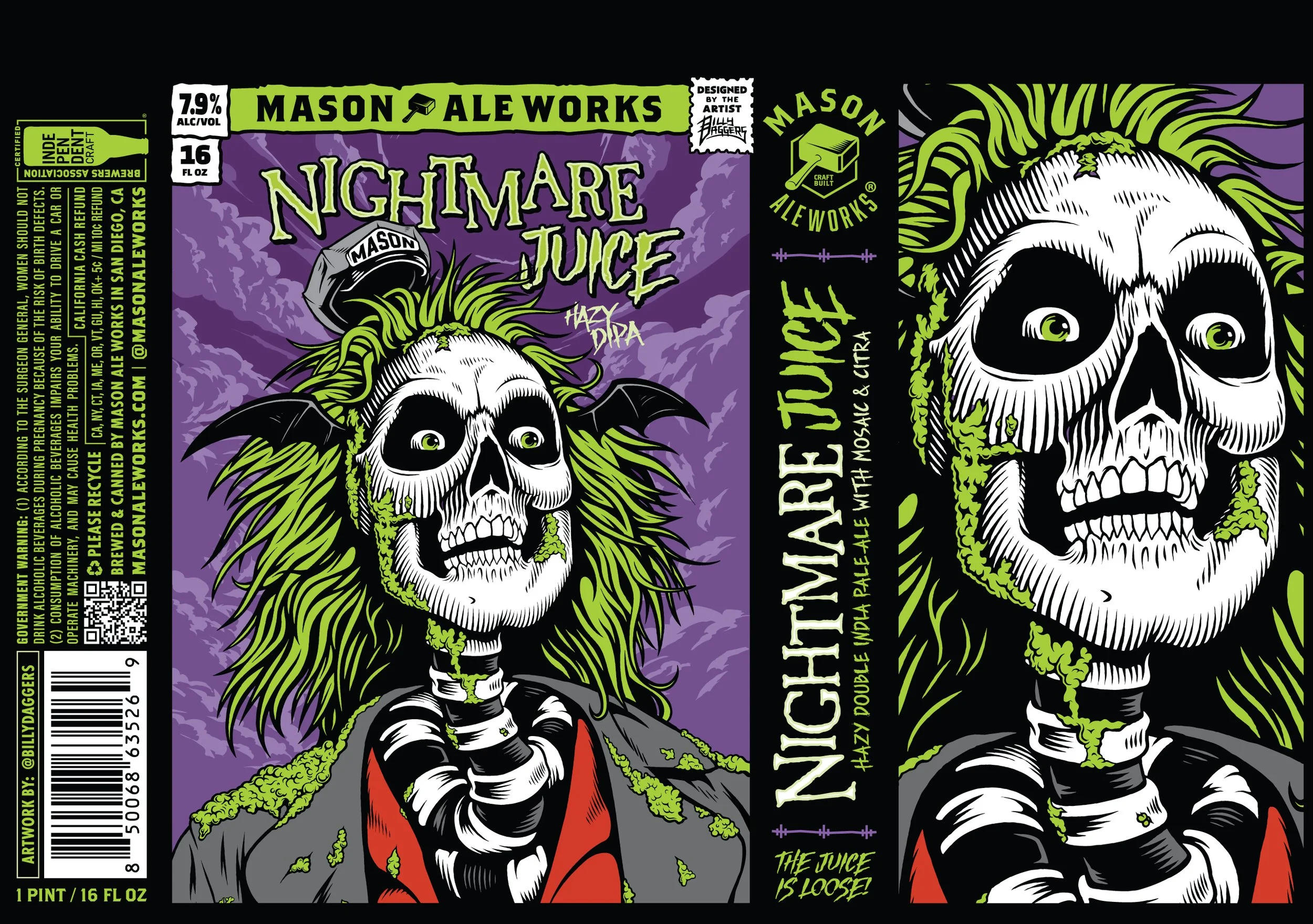
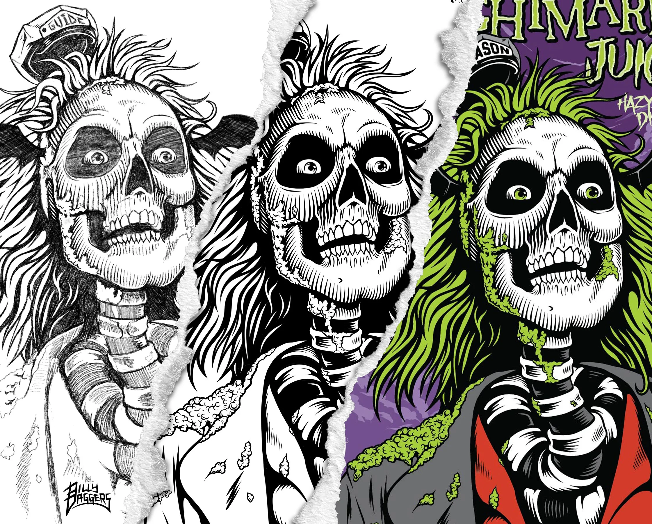
Third, Nightmare Juice gave me the chance to finally finish a design I had started years prior. I originally came up with this concept for an art show a few years ago, but ended up running out of time and abandoning it. It wasn’t until this year that I made the push to complete it. As you can probably tell, it's inspired by the movie Beetlejuice. This was replacing last year's Halloween-themed beer, Nightmare Fuel, so Nightmare Juice seemed like the perfect name to succeed it.
Okay, let’s give some other label art designers some flowers. What breweries have art that you respect and appreciate?
I’m really into Booze Brothers’ cans. They have a really iconic, clean style that’s instantly recognizable. Each label has an interesting visual twist that takes it to the next level. Their art also translates perfectly to T-shirts and other merch, which is really smart. Greece-based Seven Island Brewery creates killer artwork for their cans. Mason was their North American producer and distributor for a while, and I was always blown away at the level of detail that went into their illustrations. As a skater and lover of macabre themes, I really liked the cans and overall theme of Black Plague. They worked with some great artists and had a solid, consistent theme across the board from their tasting rooms to their beer and merch. And you can’t overlook a giant like Ballast Point. Paul Elder is a huge inspiration to anyone designing in the beer industry. He was able to take his passion for drawing and painting sea life and turn it into a decades-long career.
That’s what’s up. I will check those out and I definitely agree on Ballast. Those are the homies. Let’s talk the future. What dope art concepts do you have coming up for 2026?
I'm currently working on a handful of new additions to our popular Immortal Series featuring comic-themed Hazy IPAs, skate-themed West Coast IPAs called West Coast Rippers, and to celebrate our 10th anniversary, we just released X, a decadent stout aged three years in oak bourbon barrels, then finished with Charlie Royal cold brew coffee, Vermont maple syrup, cacao nibs, and Mexican vanilla. The beer is delicious and the label design is a collage of some of my favorite illustrations I've done since my start at Mason.
Also, keep your eyes out for some new releases I'll be designing for our sister companies Eppig Brewing, Second Chance, and Castellum Ciders.
You can follow Billy Daggers’ creative works on Instagram as @billydaggers, and check out Mason Ale Works at masonaleworks.com.
Ale Sharpton
Dennis Malcolm Byron, aka Ale Sharpton, is a world-renowned beer authority, award-winning journalist, photographer, and consultant. Although a native New Yorker and a Cornell University alumnus, Ale proudly calls Atlanta his home. You can follow his globetrotting for beer, art, fashion, cars, and everything else cool at alesharpton.com and on Instagram as @realalesharpton.